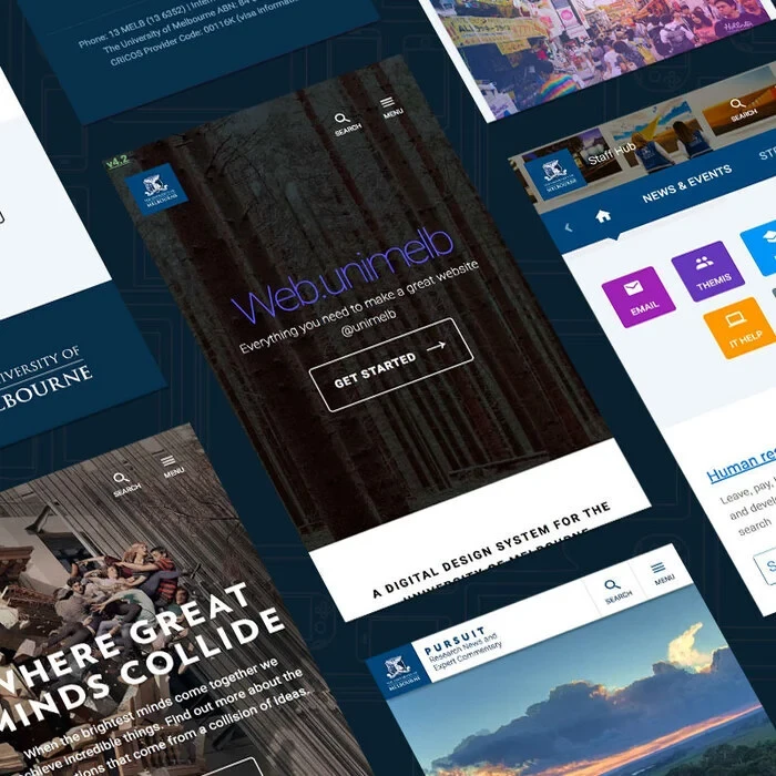
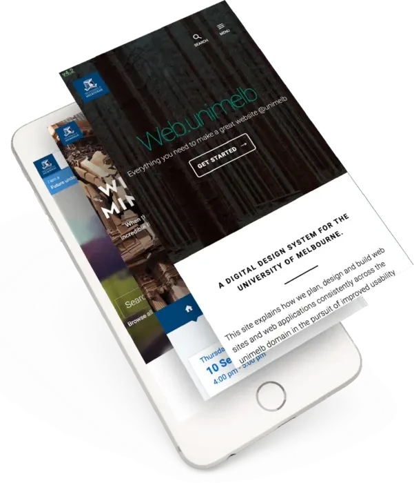
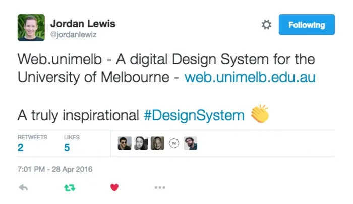
Web.Unimelb: A digital design system for the University of Melbourne
January 2013
The Challenge
The University of Melbourne has a large and sprawling web presence consisting of over 1000 websites and more than 2 million pages spread across a number of largely autonomous business units.
As digital team lead I was unhappy with the inconsistency and duplication of effort that I saw across this presence. Websites were hosted across a wide variety of CMS platforms. Each was designed and developed by a different set of designers and developers - often at great expense and of variable quality.
There was almost no way to ensure that we provided a consistency of brand, usability, navigation, accessibility or tag management across such a large web presence.
Although the University spent lots of money on designers and developers, more often than not these professionals were pulling the site apart by using different design patterns and development techniques, rather than all pulling in the same direction.

The Solution
As the leader of a small central team, I decided that there had to be a better way for the university to build websites.
Specifically I was looking to create something for the university that:
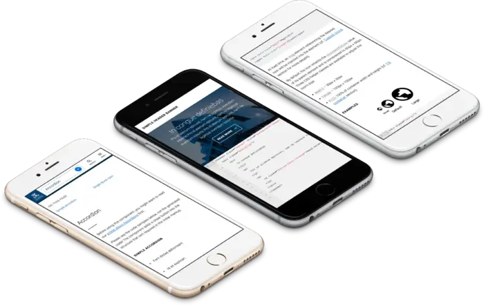
- Coupled together elegant design (with a focus on content), semantic coding standards and the guidance needed to create great content.* Provide a documentation site that was coupled to the actual code-base itself to prevent the two from getting out of sync.
- Allowed for brand assets and uni-wide navigational elements (header, footer, sitemap navigation, fonts, styles) to be centrally controlled and updated.* Provided a comprehensive library of components to make it possible for people to build almost any sort of website quickly and without the need to design or develop. They would be free to focus solely on producing the best possible content.
- Used an Open Source model (github) and versioned approach to code that would encourage contribution where issues were identified or new components needed.
- Was CMS agnostic - it’d rely on the CMS to provide correct markup, but add presentation via centrally controlled CSS and Javascript (which would be compressed, stored and versioned centrally).
- Maintainable for the long-haul (because site-wide refreshes across 1000 sites are uber expensive).


The process

The process for building this was relatively simple. I came up with the idea and worked closely with my talented team to build what is now used across many hundreds of websites.
Steps were:
- Work with the design lead to craft a look and feel for both the university as a whole, but also the individual components within the design system
- Help development team understand technical requirements around versioning, centralised control etc.
- Live prototyping (we tested an early iteration of the design system on our annual Open Day website - registrations rose more than 40%. )
- Worked with Accessibility lead to ensure that components were accessible and met our WCAG 2.0 AA requirements.
- Work with Usability lead to resolve usability issues around global components.
- Release and adapt various supported CMS platforms to output required markup.
- Continual iteration via internal slack community, github issues, user testing and experimentation.
Key product management challenges
Solve some of the more interesting challenges I helped solve during the development of web.unimelb for the University include:
- How do you allow sites (and site owners) to tailor design to their particular audiences, while still remaining true to a parent brand and feeling like part of broader university websites?
- How do you give designers and developers enough components that they don’t feel the need to develop their own (and fracture the design system)?
- How do make it possible for people to navigate both the site they are on but also understand their current position within the context of the broader university website?
- What navigation design patterns would work across all devices consistently?
- We were intentionally ruthless and opinionated during the design process. I backed the team to do their best work and take risks in order to solve problems that had stumped the university community for decades.
Designing at scale without real content
Turns out it’s really difficult to design a website when you don’t know what the content will be. Building a design system is entirely different from building most normal websites. I helped the design lead overcome this challenge by dissecting many of the universities websites to create a list of components that would be needed.
We then worked through the various components using a mobile-first approach using Sketch. Following this we prototyped into middleman and, later, a highly trafficked campaign site.
It pays to take risks (and test risky decisions)
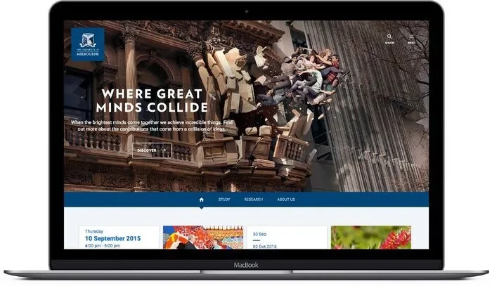
A good example of this is our singular implementation of hamburger the navigation. Rather than force users to understand horizontal navigations, tabs, drop-downs and more, we took a universal approach to navigation by using a hamburger. This controversial decision has paid off - our sites are visually impressive and, more importantly (and controversially), frequent testing shows comfort and familiarity with the hamburger design pattern.

Results
It’s difficult to overstate the impact of web.unimelb.
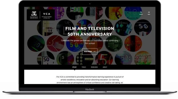
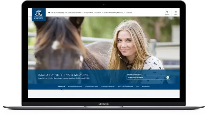
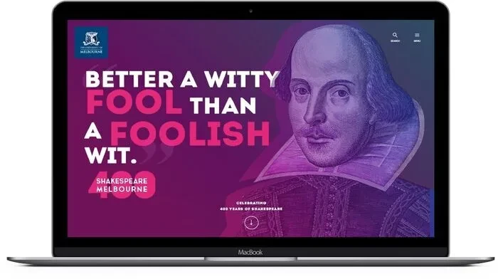
Today, a central team comprised primarily of 2 people (designer, front end developer), is able to maintain a design system used across a 2 million page website by dozens of web developers and hundreds of content maintainers.
Hundreds of websites and hundreds of thousands of pages are created using it each year. Each time this creation occurs we are saving the university from needing to commission an agency to do design, development, usability and accessibility work - often at a cost of tens or hundreds of thousands of dollars.
Conservatively, we/I have saved the university millions by implementing the design system, not to mention creating a cutting edge web framework that is the envy of many educational organisations as well as commercial ones.
Furthermore it has done the impossible in University-world and unified faculty and professional staff (designers, developers and marketers). Stakeholders seek out and demand it's clean design and functionality and designers and developers love the ease with which they can build websites. Centrally, we love the ease with which we can maintain and improve the entire University website.
Most importantly, our users love it!
Inventing and leading the creation of web.unimelb.edu.au is my single greatest professional achievement to-date.